Designing a better checkout experience
A UX/UI Case Study
A focused redesign of the checkout process to reduce cart abandonment and improve conversion rates for a food delivery platform.

Project Overview
The app allows users to order food from a variety of delicious cuisine directly to their office, as well as provide a way to track their order(s) and suggest meal combinations. The business is specific about its audience, who are the working class citizens Most users complain about (assuming these were the challenges faced) how hard it is to navigate through the app(not memorable), bad user interface (inconsistent design), a complex checkout system and most especially not being able to track their orders. These are the UX/UI challenges that I have decided to improve on, along with an order tracking system, in this case study. For the sake of this study, Plated Cuisine would be used to describe the app which the chef is using to offer her services.
Goals and Objectives:
- To improve and design a better food tracking experience
- Mobile design approach
- Minimal UI (modern and fresh)
- Easy navigation throughout the app, fewer user action approach
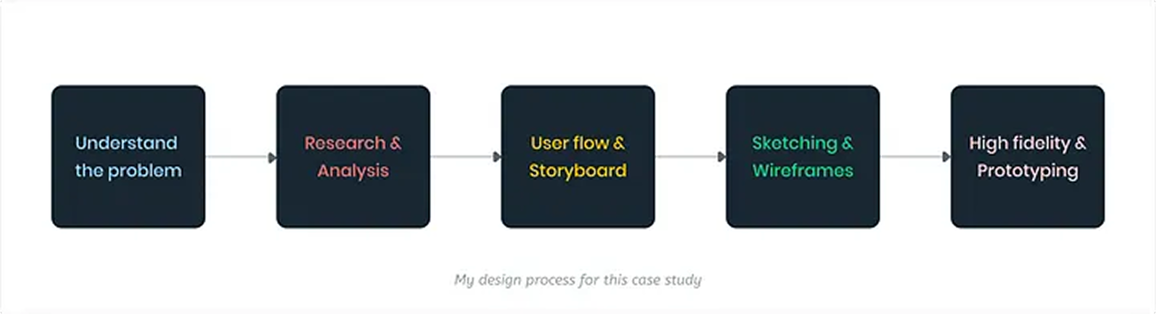
Understanding the problem
The solution is to design an app for an emerging chef who wants to offer her food services to a targeted audience (working-class people). My first step was to familiarise myself with Plated Cuisine and the business process. From having an in-person interview with her at the office, I learnt the following 9 to 5 Her business perspective, goals & objective The core purpose of this app which is “Comfort at your office”
After absorbing all the information, I was able to breakdown the project into modules — which would enable me to pay close attention to even the minute details. The essence of this is to equip me with the necessary information to use and provide a solution for the users
Research and Analysis
Now that I have a better understanding of the Plated Cuisine, I began my competitive analysis to see which companies/apps are currently dominating the market in the food delivery space, to understand their patterns and draw relevant findings such as:
- Why are users currently using this app? Is it the brand image? Food quality?
- Current issues users are facing using these applications
- Specific issues relating to the food tracking system.
After making my findings, I began to research on a global scale to see what’s new, keep in touch with the design styles and trends. With my focus being the improvement of the food delivery tracking system it has been seen through research why users abandon or cancel their orders based on some reoccurring issues like:
- Price discrepancies, which makes the users unhappy
- Users confused about when and how long their food would get to them
- Dispatch riders not conversant with proper navigation systems like google, which leads to unoptimised routes = unhappy customer
- Quality of food delivered (since most apps in question offer food services from different vendors
- Complicated menus
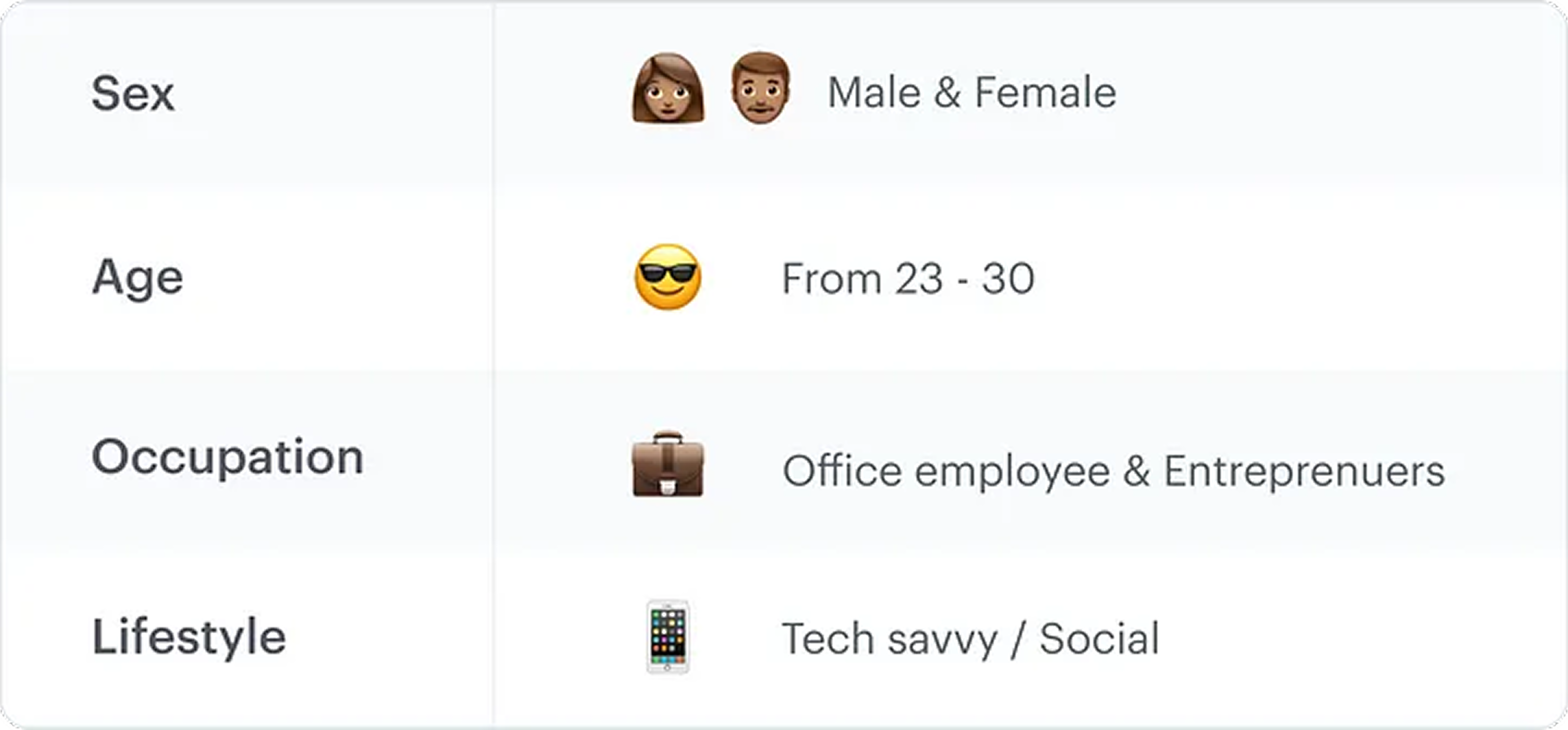
To get more insight I carried out a mini-survey which targeted the working class people (ages 23–30), I needed more data on their day to day activities and how ordering food during their busy schedule affects their routines, this enabled me to arrive at relevant conclusions, below are my findings:
Here are some of the relevant questions I asked and some feedbacks:
- What does your typical day look like?
- Why do you use food delivery services? How many of them do you use?
- What issues are you having with the current apps?
- What could be a reason you would use our solution?
- What’s your take on food quality?
- How efficiently do the current food delivery services you use help you track your order?
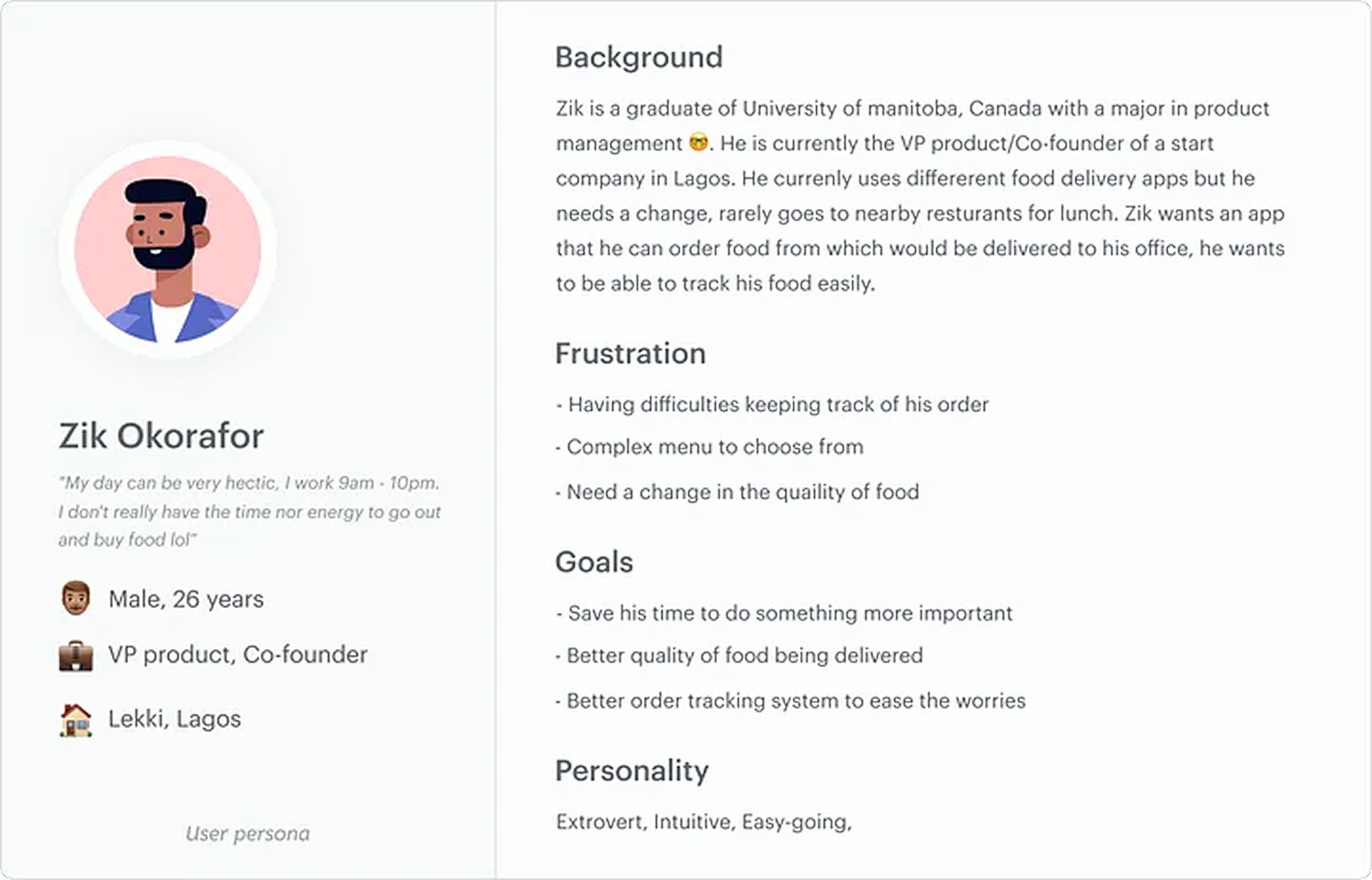
User Persona
Using the report from the survey and interview, I created a user persona that embodies the traits of the target audience. The user persona created helps me get a better understanding of the problem I’m trying to solve
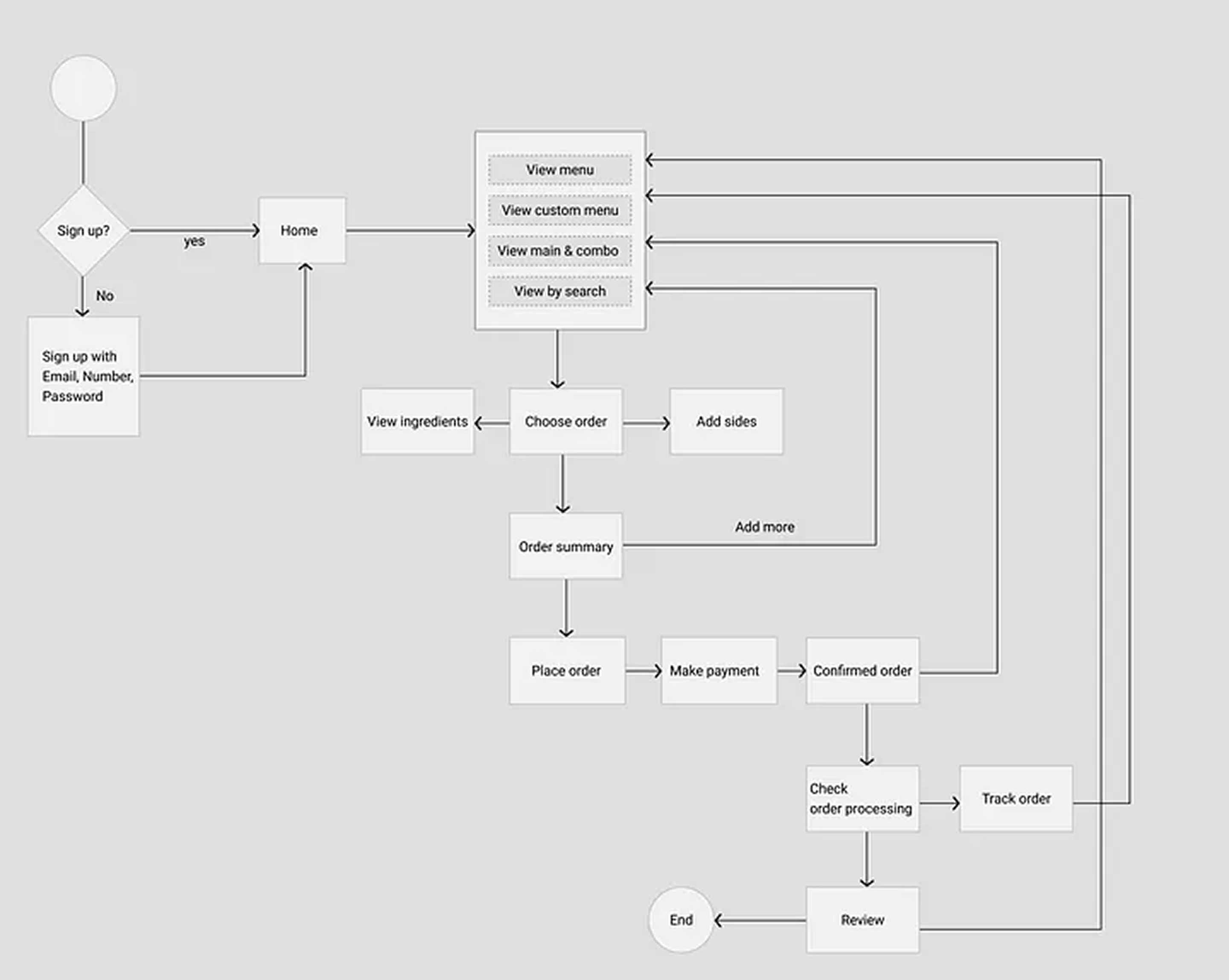
User Flows
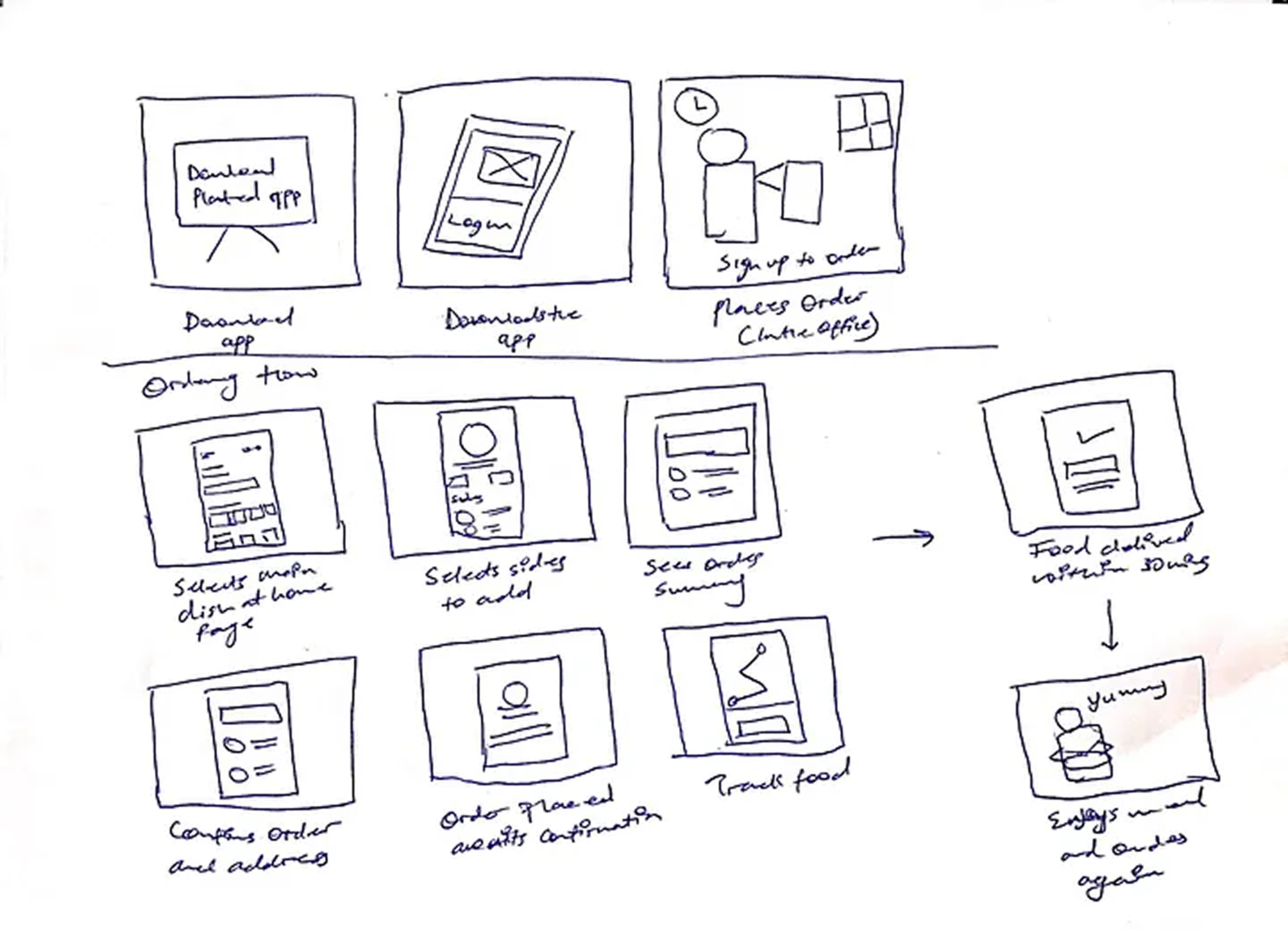
This process is all about defining the flow for plated cuisine, bringing more insight to the layouts and structure of the app. This helps to define the navigation flow for the app, aimed at making the flow and steps very easy, memorable for a user which would increase interactiveness. A user (in this case Zik) just has to register or log in once when using the app for the first time.
The app has been structured in a way to reduce the user actions to complete an order, 4 clicks are all it takes to order a meal, which is very simple and minimal.
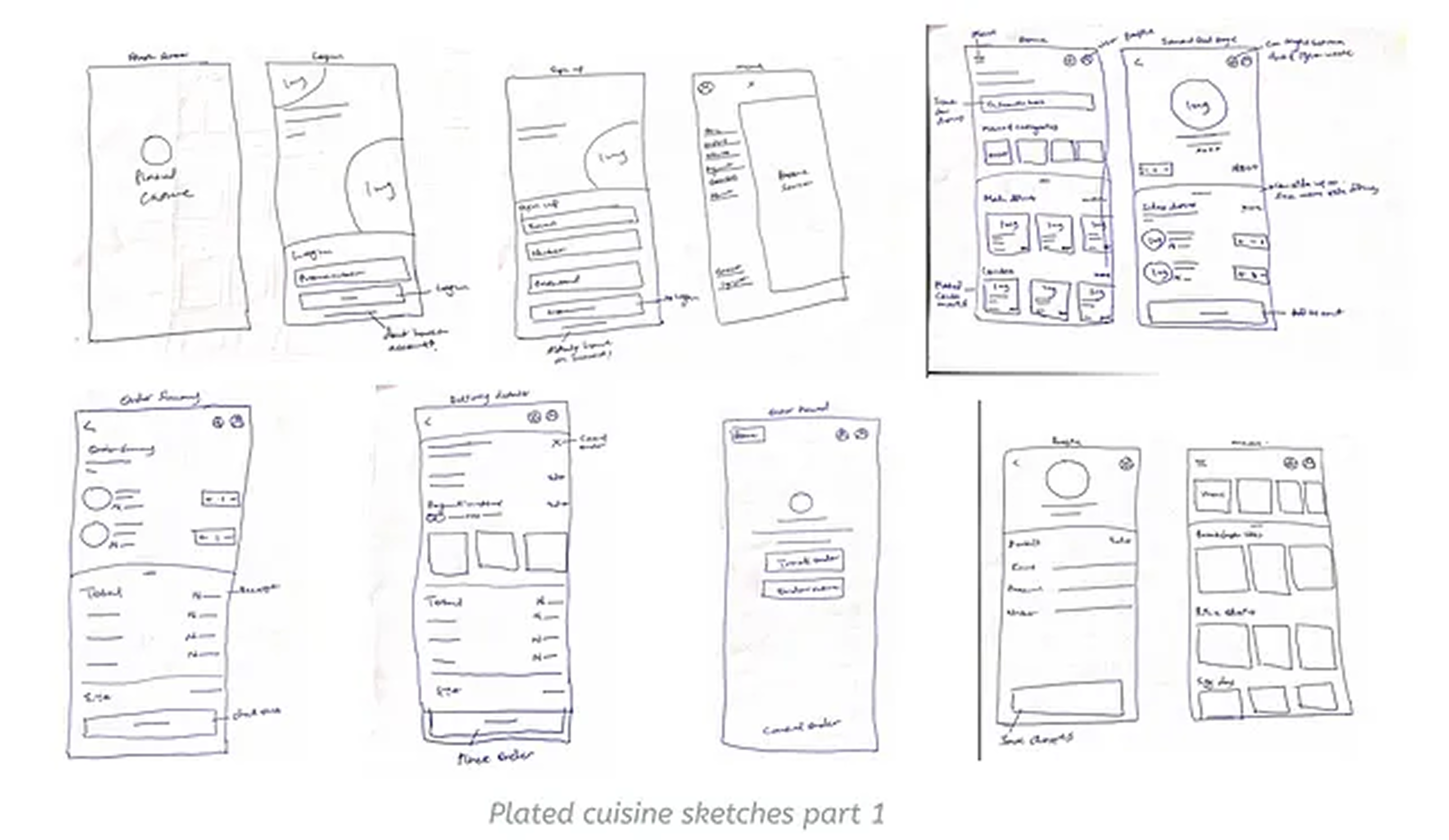
User Storyboard and Sketches
Creating a storyboard and sketches for this case study helped me emphasise with the user through (Zik) his journey giving me a more defined contextual idea and spot out challenges that may occur or user needs not put into consideration.
After several iterations in the sketching process, I was able to come up with a solution for a better food tracking experience.
Wire framing
With the sketches above the goal was to provide a solution for the pain points uncovered in the initial research. This is a form of low-fidelity wire-framing which gave me a clearer picture of how the interface would look like, also covering the basic content structure.
During this process, I crafted out how each of the screens connects together to give a seamless and smoother experience.
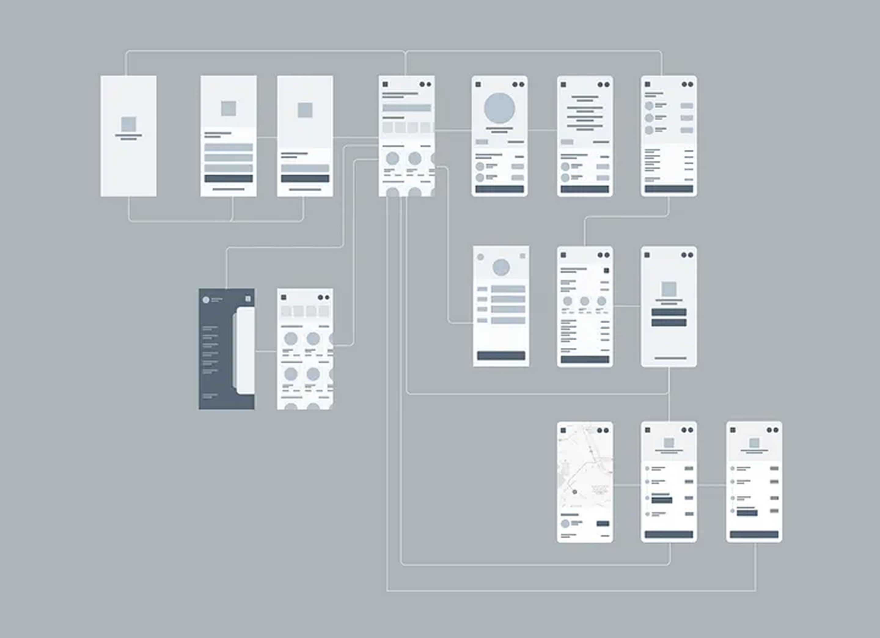
High fidelity & Prototyping
Using all the information gotten from the above sketches, user flow and wireframes I was able to convert them into a high-fidelity visual representation of the app. By using cool and neutral colours I was able to come up with a fresh & minimal design.
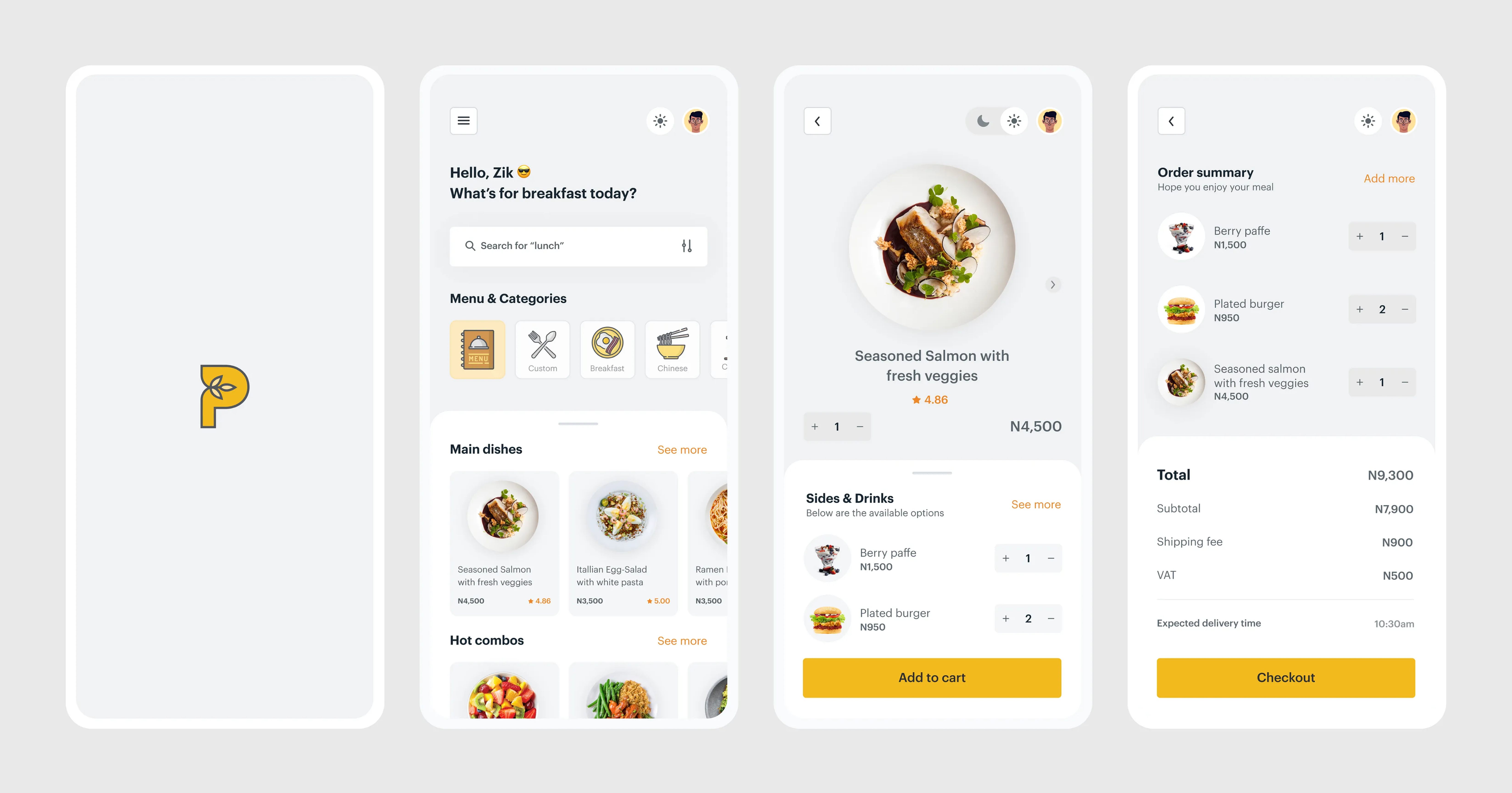
Ordering food
When a first-time user launches the app, a splash screen would be displayed which then redirects the user to the signup page. After the registration process, the user is directed to the home page where orders from a variety of delicacies can be made.
From the home screen, users can choose a dish of their choice, also a user can add sides or drinks to complement their meal from a single screen. Users can also choose between dark and light mode depending on their mood. Also, at the point of checkout users can decide to add more dishes to their order(s).
Depending on the time of the day the app suggests different meal options to the user to make the selection better. Users can set up specific meals they want to be ordering frequently. When a first time user launches the app he/she can click on custom which would display a full menu encouraging them to select the combos they want. This would make the ordering process faster and simpler. If a user wants to have more details on the food he/she wants to order, by sliding right on the food selection page (3rd screen from the left) a user can view the ingredients used to make the meal
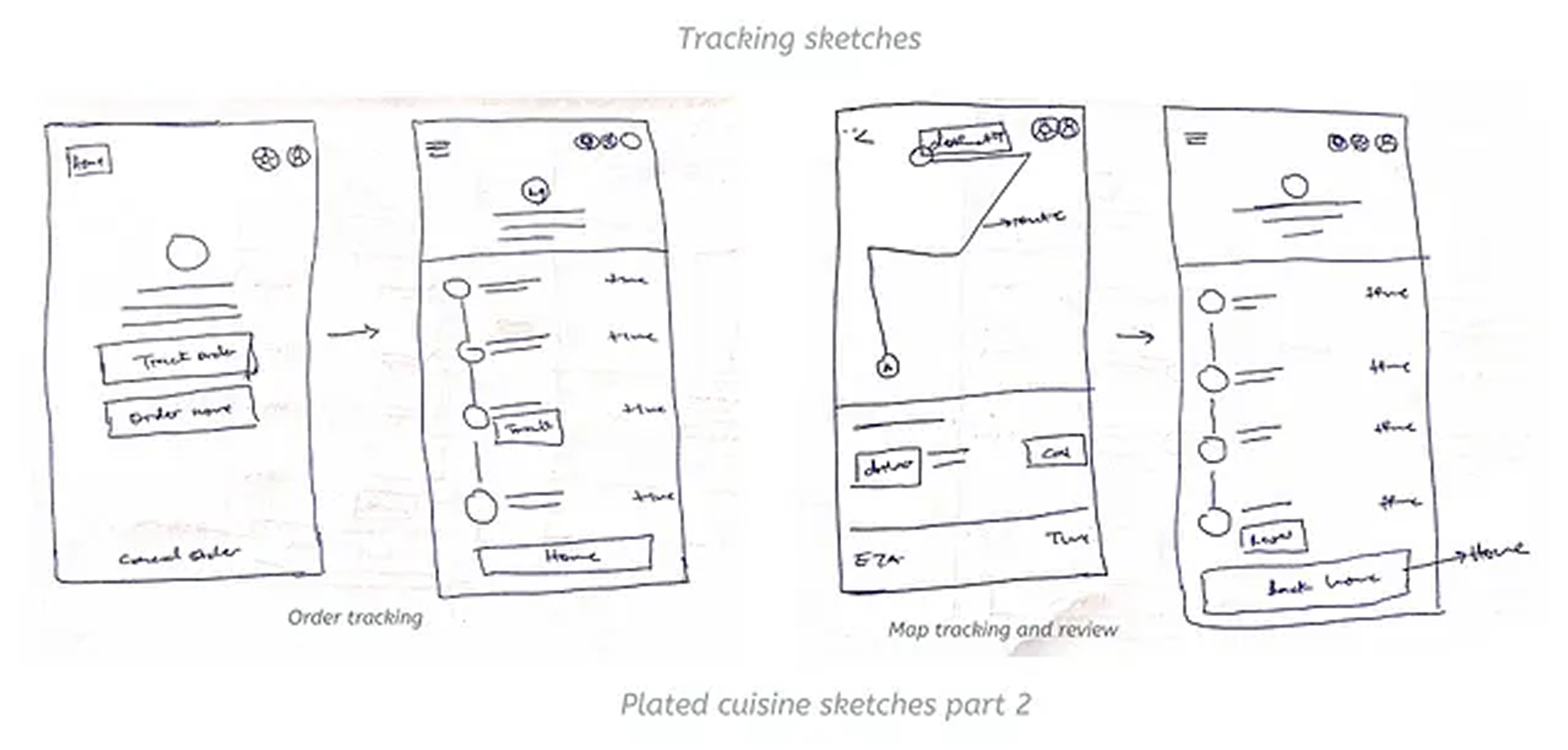
Order tracking
After research and feedback gotten from users, I was able to come up with a much simpler and user-friendly tracking solution (So Zik can have his meetings in peace). After placing an order a confirmation screen shows giving the option for a user to track an order. When a user clicks “Track my order” button a screen that shows the order progress displays, giving the user an idea as of when the order would be completed. When an order is dispatched, the user would be notified and has the option to track the rider’s movements, also a user can update their current location. When tracking the rider’s movements the user has an option to call.